Tuesday 30 November 2010

Gourmet designs

Feeling rather peckish I decided to look at design using food. Food and packaging contains so many unusual but recognisable shapes that could be used such as a banana or an egg. These items can be used to represent other things that have a connection to the food item such as a monkey is known to eat bananas or the fact that hens lay eggs, they can therefore be used as a simple means of executing a broader topic.
With food such as fruit and vegetable also comes a very broad spectrum of possible colours to include in your design. Here are some of my favourite examples I found of where food has been adapted for design.


Saturday 27 November 2010

Snow art

Due to a bad throat I have been forced to stay inside instead of being out enjoying leeds forst day of proper snow but since I was in the mood I decided to look at some art sculptures and was pretty impressed with what I found. How on earth do they do it!! I thought my snowmen were quite good but this is in a league of its own.


Friday 26 November 2010

Typography in design

I have always been interested in posters and other advertisements that just use clever typography to portray what they are trying to get across. I think when a picture is made up of letters it is very eye catching and encourages people to look at the poster for that little bit longer, a great achievement when trying to sell a product considering you would normally only get 2-3 seconds of a persons attention to a poster.

Why clog up a poster with images when the typography makes an impact by itself, you do not want to over explain your message with both text and images when not neccessary. The sticks and string below show the idea of homemade things so there is no need to explain it anymore.

This is another example, done so by adapting a typeface to a slightly smudged inky appearance which i feel is a very strong way of executing the message.

What I love most about typography is the thousands of shapes that it leaves you with that you are then able to use or manipulate to build other shapes. Below are some examples of this, in some cases an image of relevance to the type is constructed in others it is just the case of clever placement to make the final outcome visually interesting and engaging.


I think many people can underestimate typography as a design tool but the choice of typeface is vital to any project, it can give the your work a completely different feel. For example a spooky looking font would not be appropriate on a charity advertisement but a Halloween poster would not have the same impact if it did not have it and opted for a simple, plain font that would be seen on serious office documents so therefore the typeface used must be chosen carefully and fit the mood of the document. There is after all tens of thousands to choose from, so you are bound to find one to match any occasion, and if
not you can always create you own as after all.............


Tuesday 23 November 2010

eye catching advertising

I am currently doing an advertising project, promoting my pasta brand and so have been researching effective campaigns. I would like to share some of my favourite adverts with you.


Tuesday 16 November 2010

Cool Stop Motion Video - Brother Commercial %141 (Architect)


I love this advertisment, I think it is really cleverly done, and very visually interesting. I believe it is showing us to dream big, this guy is getting to watch his dream unfold, grow and spread. It always leaves me in a good, inspired mood. Check it out.

Friday 5 November 2010

When procrastination becomes inspiration

When I am struggling to come up with creative ideas or putting off researching new projects I am very easily distracted and will do anything in order not to have to start working again, from making countless cups of tea, to checking up on all my friends on facebook, phoning every family member for a catch up, rearranging my entire bedroom or attempting a recipe that I know it out of my league. However I have thought that during some of the popular procrastination hobbies inspiration can be found.
I have on several occasions found ideas for shapes from simply looking around my room or walking home. Something ever so remote can catch the eye and spark an idea. Looking through photographs on facebook or on my wall have given me compositional ideas or of angles to take on a poster for instance.
These are some examples I have found of when procrastination has turned to inspiration:
Would you ever think that drawing moustaches on models in magazines could lead to a political campaign?


Whilst the first may be vandalism, the second was the actual campaign and may be derived from scribbling on magazines. 


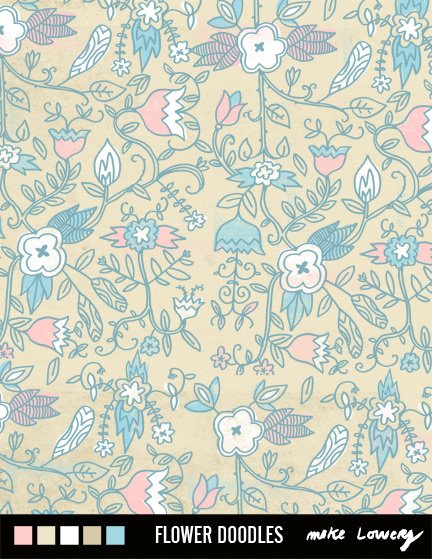
Or that doodling on a scrap page could result in some great textile designs and could be hung on walls everywhere or the forever changing google homepage logo.


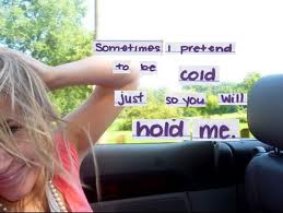
Listening to music and their lyrics can have a huge influence. If certain lyrics stand out to you or are of significance to you, you may have inspiration to illustrate them which can go on to be used in a project. I find that this is a great way to portray a certain emotion that you are trying to get across in some work by listening to music with the same feelings behind it to help you get in the mood that you are trying to demonstrate.
You can find ideas in the funniest places so never close your creative mind you never know what you will find.