

Tuesday 13 December 2011
Wednesday 28 September 2011
Frankenstein
I have started my placement in Coleraine for the year so been very busy. Currently designing some halloween posters for Kellys nightclub, mostly using photographs but have also been practising some illustration which I feel has improved massively. Here is an illustration of Frankensteins head that I drew today.


Tuesday 21 June 2011
21st invitation
I worked with a girl who told me what she wanted so we could quickly come up with an invitation to her 21st birthday so she could get it to the printers asap. We had a quick brainstorm, she chose images she wanted which I then played around with in terms of composition. This was the final invite (contact details changed for security purposes)
![]()

Monday 20 June 2011
NISF logo
The Northern Ireland Squirrel Forum wanted a new logo to promote the protection of red squirrels following a new outbreak of pox. These are 2 variations of my design which they want to use.
![]()
![]()


Wednesday 20 April 2011
Elevator Advertising
An elevator provides a very different advertising experience and has opened the possibilities for many clever campaigns that have used the idea of the elevator doors opening and closing, the closed in a box feel some people get, the lack of effort or energy required to effectively communicate their message. Here are a few examples:
 |
| Great lakes science centre, using concept of opening up and seeing inside. |
 |
| Oreo Dunking biscuit- Oreo is on the moving part so goes in and out of stationary milk. |
 |
| Superman opening his jacket to reveal the costume idea to promote the movie. |
 |
| Sticker to make it seem the door isnt closed properly to promote the Fiat Punto parking sensor. |
 |
| Elevator which reveals stairs to promote healthy butter and low cholesterol, guilt tripping people for taking the lazy option. |
 |
| Putting message of Quantamino prisoners that are held in isolation. |
 |
| Inside of elevator used to feel like a fish tank, promoting jelly tots, aimed at kids. |
Friday 11 February 2011
Latest Kinamba logo
There was a slight hiccup in the designing of the logo where the design had to be in Black and White so it was back to the drawing board. They also wanted more focus on Africa and hope rather than primary school.
This is my design which they have chosen to use, it is a tree to represent life and hope:

This is my design which they have chosen to use, it is a tree to represent life and hope:

Tuesday 8 February 2011
Window displays
I visited London on the weekend and as always I was impressed with the window displays especially at Selfridges which is famous for their window dressing displays. Windows provide a space where designers can go crazy and create something eye catching from any item in store to make passers by stop and enter the shop. Here are a few I found and liked from a variety of shops:


Wednesday 2 February 2011
Kinamba Charity Logo
The Kinamba project is a newly established charity that provides nursery and primary education for the poorest children in the outskirts of Kigalii in Rwanda. It also provides adult language and literacy classes and craft programmes. I was asked to design the logo and based my design on the primary colours and shapes that children would learn at nursery and primary school and built them up to make a K:


Battle of the Bands
I was asked to design flyers, posters and tickets for another charity event. 'Battle of the Bands' raising money for CLIC sargent for children with cancer. I went for bold bright and simple so that it is easily seen. I wanted minimalistic text so that it did not loose interest from people looking at it and in the case of the flyers stands less chance of been thrown out straight away. Here is the design I produced:


Monday 31 January 2011
My typography project
This is a poster that I made in 1st year when we had a typography project. The brief was to design a poster showing the good qualities of a given font. I was given Clarendon, through research I discovered that it was used for wanted posters so decided to base mine on this and represent Clarendon as a person to help describe it's high points. Ive only just been able to convert it to a jpeg as my laptop doesnt have Clanendon which wasnt helpful when doing this project but luckily I had access to macs in university.
This was my final poster:

Label and packet design
When shopping in Sainsbury's I tried to stick to my new years resolution of eating healthier by staying away from the biscuit aisle. Looking for new healthy snacks I noticed a lot of cool labels of products I would not normally consider so I have decided to have a look at what interesting label and packet designs I can find. Here's my favourite that I found:


Wednesday 19 January 2011
new Cv cover
I quickly went off my old design and so started from stratch and this is what I came up with. I much prefer it and think this is the one that I will send off and fingers crossed somewhere will want me!


Saturday 15 January 2011
CV cover idea
I have been working on my CV ready to find a placement for next year. After a couple of drafts I have come up with this:


Sunday 9 January 2011
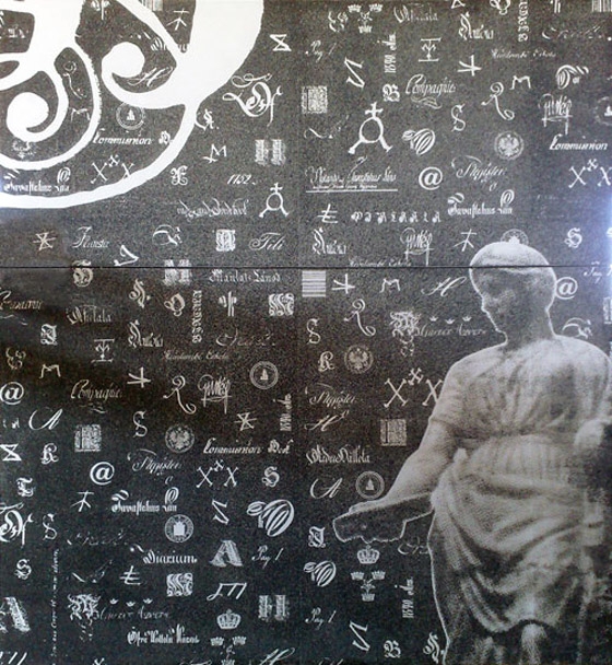
art magazine
Over summer I spent a week on an intense weeks course where I worked in a team with 5 other graphic designers to produce a magazine. We worked alongside a group of photographers and journalists who gave us all of the material we needed. The magazine was based on the arts of Belfast and what there is to do in Northern Ireland and is currently available. The PDF I was sent is faulty and only lets you see the front cover but I have hardcopies for anyone interested but this was the front cover which we came up with as a group.


Saturday 8 January 2011
Pasta project 2nd brief- advertising.
For the second part of the pasta project I had to advertise my product in 3 ways I chose the following to advertise farmer Joes loacal environmentally friendly pasta:


The First was a 3D bus stop where the glass compartment is divided into sections using clear plastic panels to form the shape of a Union Jack as Farmer Joes is proud to be british. Each section of the flag will be filled with pasta or wheat making it look more interesting and eye-catching. I chose the bus stop for several reasons. When people are waiting for a bus they have more time to look around and really absorb my advertisement, taking the bus fits in with my environmentally friendly appeal and it also gives the impression of being local another feature I want to stress so it ticks all the boxes for location.

This is farmer Joes tractor rides for children based on pester power. It will be located at all busy public places such as cinemas, theme parks, airports and of course supermarkets where it will also have a stand of farmer Joes pasta beside it. Parents not only need to pay £1 for each ride which will bring more revenue to the company but they then also need to sit and watch their child on the ride for 3 minutes whilst staring at my advertisment giving it time to really sink in. I am hoping that this would help my brand to become a loved household name.

The third form of advertisment is a wooden road side sign. It fits in with my rural feel of Farmer Joes. I believe it ill stand out dramatically to the thousands of daily road users as it will be such a contrast to all the current metal signs. The fact that the signs will be hand painted gives the indication of homemade pasta. The 'Any left' and arrow is to tie-in the fact that it is a road sign and the fact that farmer joes is anywhere, all around is British soil, home of Farmer Joes.
Pasta project
This term I was given the brief of re branding pasta. I went for a friendly, local brand called Farmer Joe's with a lovable farmer Joe character. The main feature of my bag which made it stand out is the resealable seal across the top keeping the pasta fresh as well as insuring a firm close as i found the stickers on current packets did not work properly, pasta still spilt, the sticker lost its stickiness and the bag ripped easily when initially opening it so I wanted to produce a simple effective bag with a more durable plastic for people who like to bulk buy like mums. These bags are also reusable shown by the macaroni reuse sign and can be used for freezer bags or packed lunches etc when rinsed. I wanted to produce an environmentally friendly brand to fit with the rural feel I was going for so not only is the bag reusable but the factories in which it is produced is run on renewable energy.
People like to buy pasta in bulk as it is frequently used and as my product is ethical, efficient and has a strong brand all for around the same price as other products in the market I do believe it would be in high demand and be successful.


People like to buy pasta in bulk as it is frequently used and as my product is ethical, efficient and has a strong brand all for around the same price as other products in the market I do believe it would be in high demand and be successful.


Friday 7 January 2011
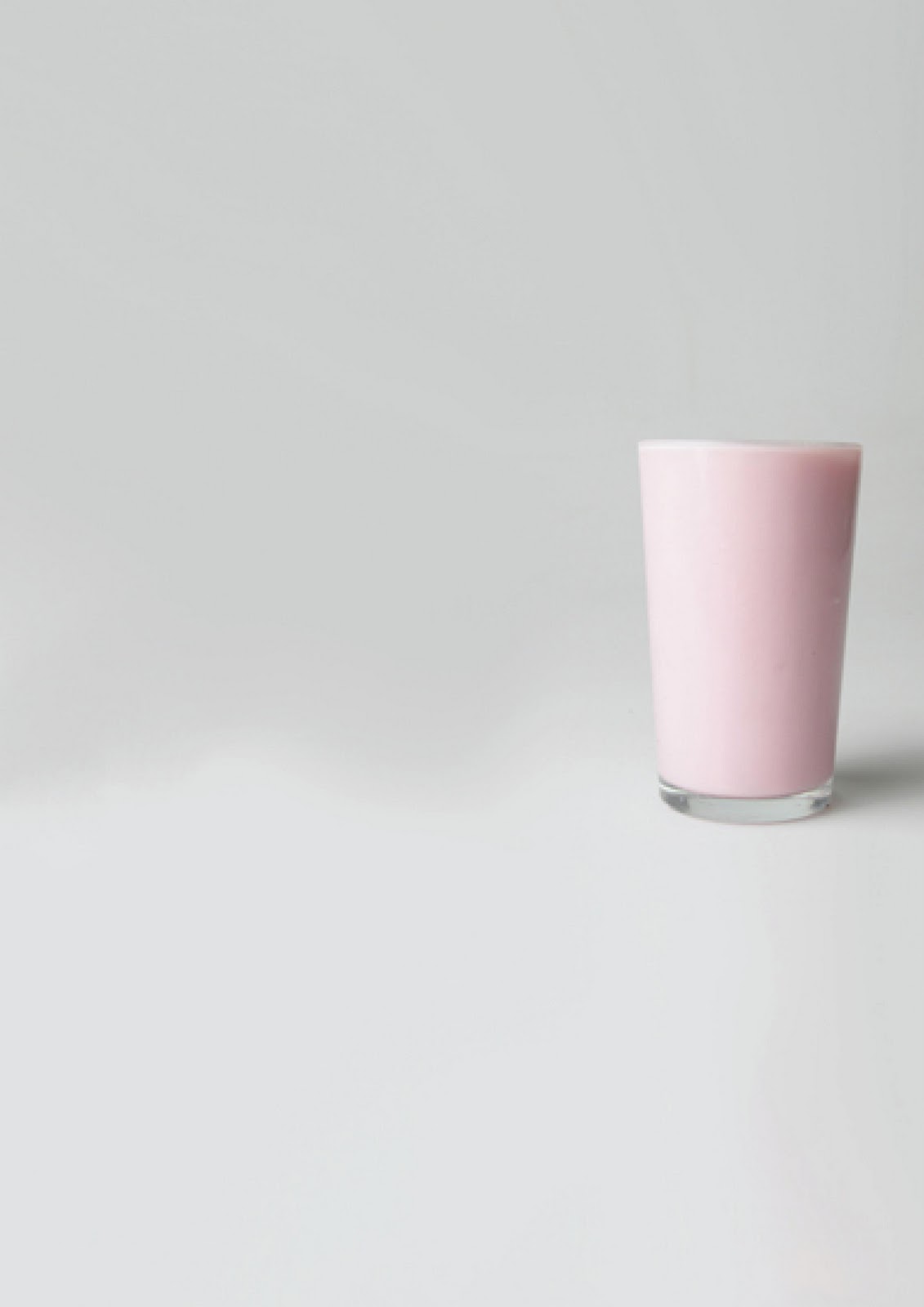
My 1st yr group project
Starting University and Graphic design was made less daunting by the revelation from our lecturer that we would be doing a group project which was also the perfect oportunity to make friends and settle in.
The brief was to get to know each oher and to then create posters that represent our personalities. We chose to use milk and to have them looking the same so that they looked like they were from the same group but to adapt the milk to fit each individual person. I was the bubbly milk, Katie the mature one of the group was the cheese, Paddy the mysterious member was depicted by the dark shadowed glass of milk, Geneva the free spirit was the escaped milk, Jess the sarcastic one was the icey milk, the pink milk was chosen for girlie Rebecca and the upside down milk was allocated to ditsy, easily confused Sarah. I was really pleased with the result and even more pleased when we recieved a 1st for them.


The brief was to get to know each oher and to then create posters that represent our personalities. We chose to use milk and to have them looking the same so that they looked like they were from the same group but to adapt the milk to fit each individual person. I was the bubbly milk, Katie the mature one of the group was the cheese, Paddy the mysterious member was depicted by the dark shadowed glass of milk, Geneva the free spirit was the escaped milk, Jess the sarcastic one was the icey milk, the pink milk was chosen for girlie Rebecca and the upside down milk was allocated to ditsy, easily confused Sarah. I was really pleased with the result and even more pleased when we recieved a 1st for them.


Thursday 6 January 2011
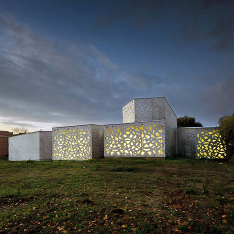
Graphic design on buildings
I had a look at patterns on buildings as I saw a clear link between graphic design and architecture in these buildings and many more. Buildings have so many interesting shapes and patterns that could prove useful when it comes to getting ideas for a design project. The inspiration you are looking for could be hidden within a building.
This Arab world institute in Paris by Jean Nouvel- he has based the skin of the building on Islamic patterns.
All of the shapes are motorised and open and close allowing magnificent rays of sunshine in.The second of the the two images of it shows them slightly opened.


These next two images are of the Hameenlinna provincial archive in Finland. By Heikkinen-Komonen architects. The exterior of this building has been livened up by the designs which are based on material from inside the archive.

Lile Metropole museum of modern art in France by Manualle Gautrand
Cathedral of Brasilia by Oscar Niemeyer in Brazil. Beautiful shapes and patterns. A great modern take on stained glass.

Transport house in good old Belfast by J.J Brennan inspired by Michael Scotts successful use of the international style used in the Busaras bus station in Dublin. When I see this mosaic it reminds me of a designers sketch book with experimentation of shapes and colours.

This Arab world institute in Paris by Jean Nouvel- he has based the skin of the building on Islamic patterns.
All of the shapes are motorised and open and close allowing magnificent rays of sunshine in.The second of the the two images of it shows them slightly opened.
These next two images are of the Hameenlinna provincial archive in Finland. By Heikkinen-Komonen architects. The exterior of this building has been livened up by the designs which are based on material from inside the archive.
Lile Metropole museum of modern art in France by Manualle Gautrand
Cathedral of Brasilia by Oscar Niemeyer in Brazil. Beautiful shapes and patterns. A great modern take on stained glass.
Transport house in good old Belfast by J.J Brennan inspired by Michael Scotts successful use of the international style used in the Busaras bus station in Dublin. When I see this mosaic it reminds me of a designers sketch book with experimentation of shapes and colours.
Subscribe to:
Posts (Atom)